This is a review of the Wooster Brush 4174-2 1/2 Ultra/Pro Firm Lindbeck Angle Sash Paintbrush, 2.5-Inch. This particular brush comes in a variety of widths, from 1 1/2 to 3 1/2 inch sizes. I prefer working with the 2 1/2 on a day to day basis, so I can vouch it's a great all-round brush. I typically use it for indoor work, though product description states it's suitable for outdoors as well.
The Wooster website claims it's been a top-seller for over 15 years. The Wooster Company itself has been in business since 1851.
I look at a few things when I am reviewing a brush: Bristle Type, Handle Type and Bristle Loss.
Bristle Type: Nylon and Polyester
Nylon/polyester blend brushes should be a staple in your brush collection because they are suitable for both oil and latex paints. The combination of nylon and polyester synthetic fiber allows the brush to keep good flex. If you clean these properly after every use they should last a while.
The purple nylon makes it recognizable as Wooster.
Handle Type: Sealed Maple Wooden Handle
I prefer a wood handled brush, They are more comfortable in my hands, and they clean up just as well.
Bristle Loss: 10/10
There is nothing more annoying than trying to get a loose bristle off a wet wall. Darn near impossible with short fingernails. (I have only found one solution for this: Stop buying cheap paintbrushes.) Wooster is typically great for keeping everything in place though, so I'll give them a 10 out of 10 on this one.
Overall, this is one of my favorite all-round brushes. They cut in well, and keep their shape.
Picking out a new paint color can be daunting, but there are many tools out there to help you choose a new paint color for your room. Do you pick a bold statement color and be the envy of all your friends? Or go with a neutral color and pick some funky throw pillows that remind you of the trip you took last year? No matter what tool you end up using, it all comes down to a feeling.
The bottom line is, if you love it, it's the right color.
Start with this video:
What color suits what mood?
Different colors make you feel different things, even if you don't realize it. Take a look at the room you are in and think about the color you are looking at.
Warm Colors (Red, Orange, Yellow)
Think of the warm colors of a blazing fireplace. These colors represent strength, energy, power and can stimulate even the appetite.
Cool Colors (Green, Blue, Violet)
Think of the cool colors of the ocean. These colors represent life, renewal, serenity and communicates a sense of calm.
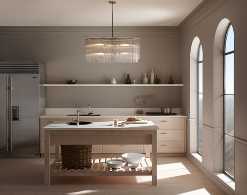
Neutral Colors (Beige, Taupe, White, Grey, Black)
These colors are always in style and can be adapted to usually any color scheme. They put your furnishings in the forefront, and allow your personality to shine through other ways.
How to use the color wheel
The color wheel is important to keep in mind when picking paint colors, so you can see what colors are complementary, what colors are related, and what to use for a monochromatic scheme. The human brain likes to see organized patterns in color and certain combinations result in a pleasing experience.
Complementary Colors
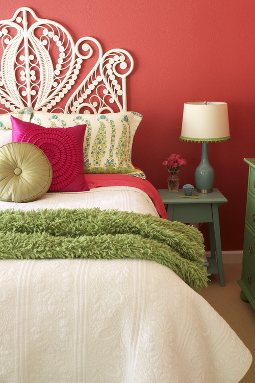
Complementary colors are directly opposite each other on the color wheel. Like purple and yellow, or blue and orange, these complementary colors are in direct contrast to each other. It sounds crazy, but think about the LA Lakers colours, Christmas colors, or think of every action movie poster ever. Complementary colors tend to be more energizing. Pictured here is two complementary tertiary colors, pink and green.
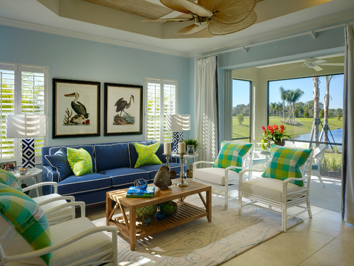
Related colors are directly next to each other on the color wheel. The result is less contrast, and more soothing. This room uses a few blues, blue-green and green and despite all the different colors, still comes off looking unified.
Monochromatic colors are of the same hue, but different saturation, If you pick up a paint chip at the paint store, it's likely to have five or six other colors on it in the same hue. Use these colors in your decor for a monochromatic hue. The result can be pleasing, but be careful about using too much of the same color, as it can easily become boring.
Don't pick your paint color first
Do pick up on colors that exist already in the space
Don't pick a trendy color unless you plan on painting every year or two
Do use accents in trendy colors such as throw pillows or lamps
Don't treat each space individually
Do look at the home as a whole and let the rooms flow together
In Summary
Pick a color that suits your personality, your furnishings, the rest of the house, and how you use the room. The color should be a color that enhances the room, and...you gotta love it.